

Dashboard
The Dashboard is the Console’s landing page. It summarizes spend, traffic, and account health for the last 30 days.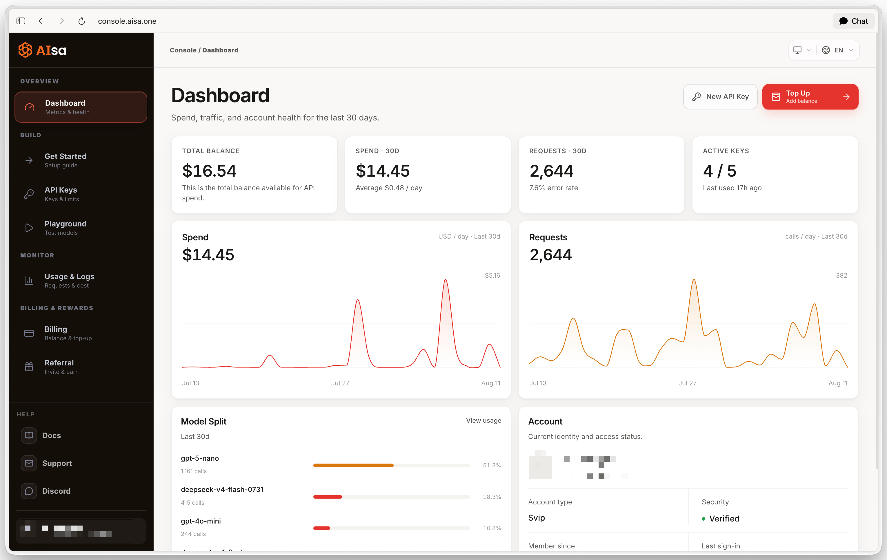

- Total Balance - credit available for API spend, drawn down as requests are processed.
- Spend · 30D - what your traffic cost over the last 30 days, with the daily average.
- Requests · 30D - calls in the same window, with the error rate. A rising error rate is usually the first sign of a bad key, an unavailable model, or a malformed request.
- Active Keys - enabled keys out of total, and when any key was last used.
Playground
The Playground sends real requests through the same endpoints your code uses and shows the exact request body and raw response. You need at least one enabled key.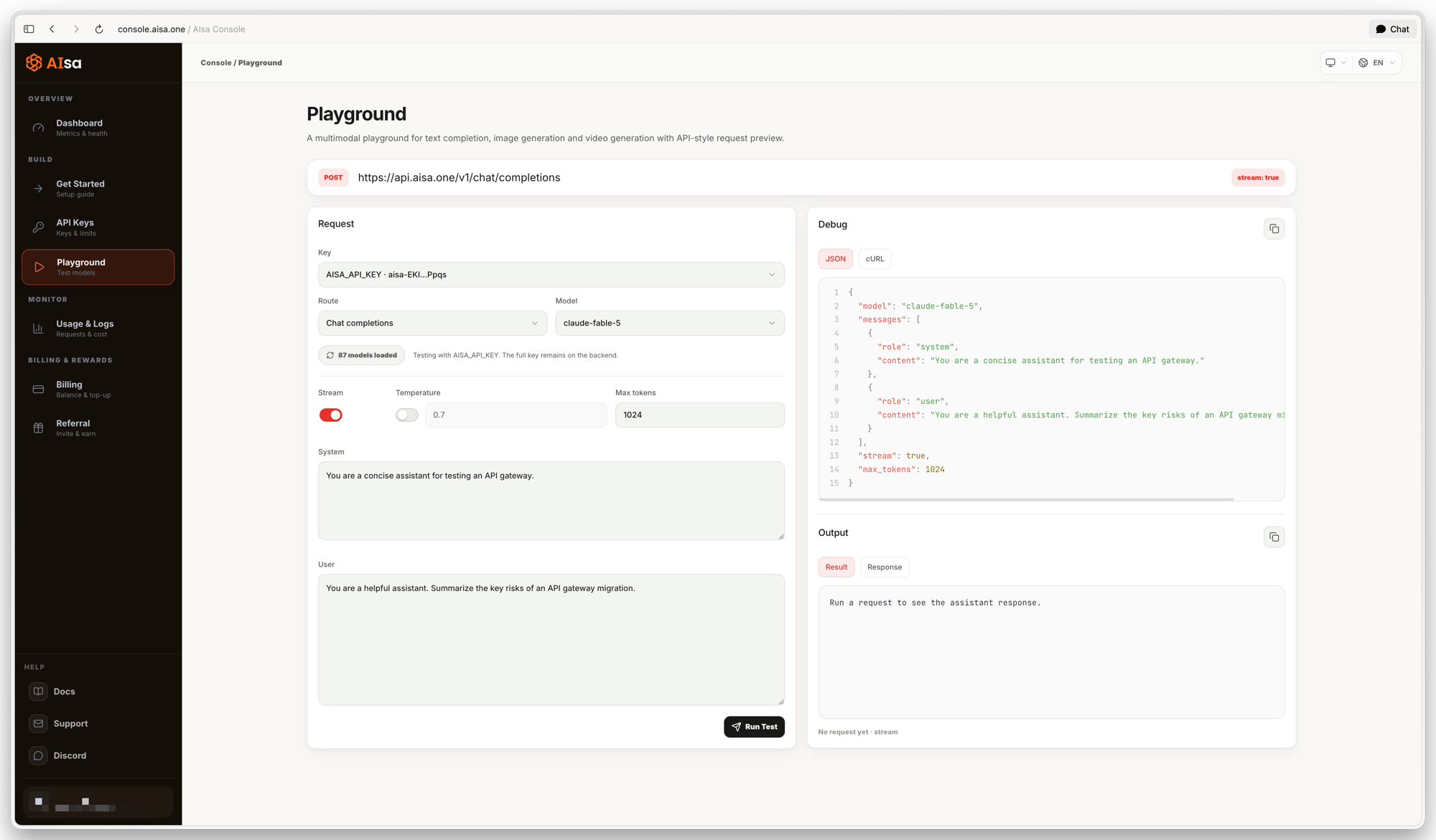
- Key - choose which of your enabled keys authenticates the request. The full key never reaches the browser, and usage is attributed to that key, so a dedicated key keeps Playground traffic separate.
- Route - Chat completions (
POST /v1/chat/completions, OpenAI-compatible) or Messages (POST /v1/messages, Anthropic-compatible). The model list reloads, because the routes serve different models. - Model - every model the key can reach on that route. If you are on trial credit and a model needs a paid balance, Run Test is disabled for it.
- Parameters - Stream, Temperature (opt-in; off means the model default), Max tokens, and the System and User prompts.
- Run Test - becomes Stop while the request is in flight.
$AISA_API_KEY - the fastest way to move a working configuration into a script. If a prompt contains a single quote ('), escape it before running the cURL in a shell.
The output panel shows the extracted Result and the raw Response, with latency and the x-request-id. Use that ID to find the call in Usage & Logs or when contacting support. Playground requests are billed exactly like API requests.
Usage and Logs
Usage & Logs is the per-request record of the last 30 days of traffic through your keys. Every figure on the page follows the filters you apply.
Typical uses: filter by Failed to debug a call, find which model and key drove a cost spike, confirm prompt caching works by comparing cache reads with total tokens, and audit everything one key has done.
Query usage with an API key
GET https://api.aisa.one/v1/usage returns aggregate usage for the authenticated key by default. Use the same key that made the calls. It is not a per-request log; use the Console above to inspect individual calls.
totals.charged_micros_usd is the actual charged amount; divide integer micro-USD by 1,000,000 for USD. totals.usage_value_micros_usd is usage value and can differ from the charge. Compare the same key, time window and currency when reconciling. This aggregate does not prove the outcome of a specific request or that a historical top-up succeeded.